Introduction to Visual Diagnostics
Diagnostic plots are your model's way of telling you what's working and what isn't. They reveal patterns invisible in summary statistics and help you decide whether your model is trustworthy for making predictions or inferences.
What You'll Learn
- Interpret residual plots to check linearity and homoscedasticity
- Use Q-Q plots to assess normality of residuals
- Identify influential points and outliers with Cook's distance
- Understand leverage and its impact on model estimates
- Apply a systematic diagnostic workflow to any model
- Know when model assumptions are violated and what to do about it
- Completed basic modeling and model comparison tutorials
- Understanding of residuals and fitted values
- Same packages:
tidyverse,glmmTMB,broom.mixed - Basic knowledge of statistical assumptions
We'll use our best model from the previous lesson: mpg ~ wt * hp, which showed strong predictive performance. But does it meet the assumptions required for valid statistical inference?
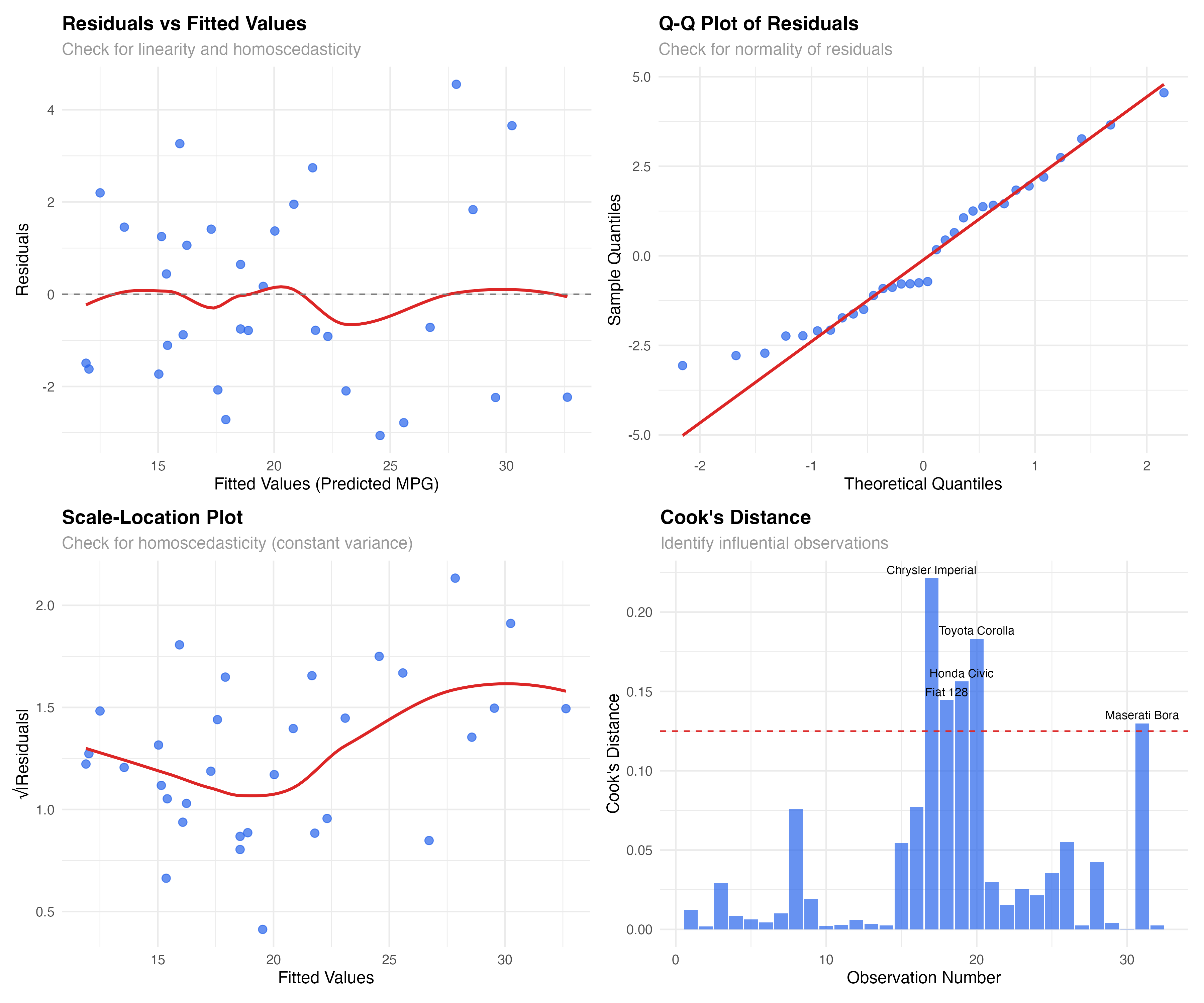
Residuals vs Fitted Values: The Foundation
The residuals vs fitted plot is your first and most important diagnostic. It reveals whether your model captures the true relationship in the data or if important patterns remain unexplained.
# Set up our analysis with the best model from previous lesson
library(tidyverse)
library(glmmTMB)
library(broom.mixed)

data(mtcars)

# Our best model: Weight-Horsepower interaction
model_final <- glmmTMB(mpg ~ wt * hp, data = mtcars)
model_data <- augment(model_final)

# Create residuals vs fitted plot
ggplot(model_data, aes(x = .fitted, y = .resid)) +
  geom_point(alpha = 0.7, size = 2.5, color = "#2563eb") +
  geom_smooth(se = FALSE, color = "#dc2626", linewidth = 1) +
  geom_hline(yintercept = 0, linetype = "dashed", color = "gray50") +
  labs(
    title = "Residuals vs Fitted Values",
    subtitle = "Check for linearity and homoscedasticity",
    x = "Fitted Values (Predicted MPG)",
    y = "Residuals"
  ) +
  theme_minimal()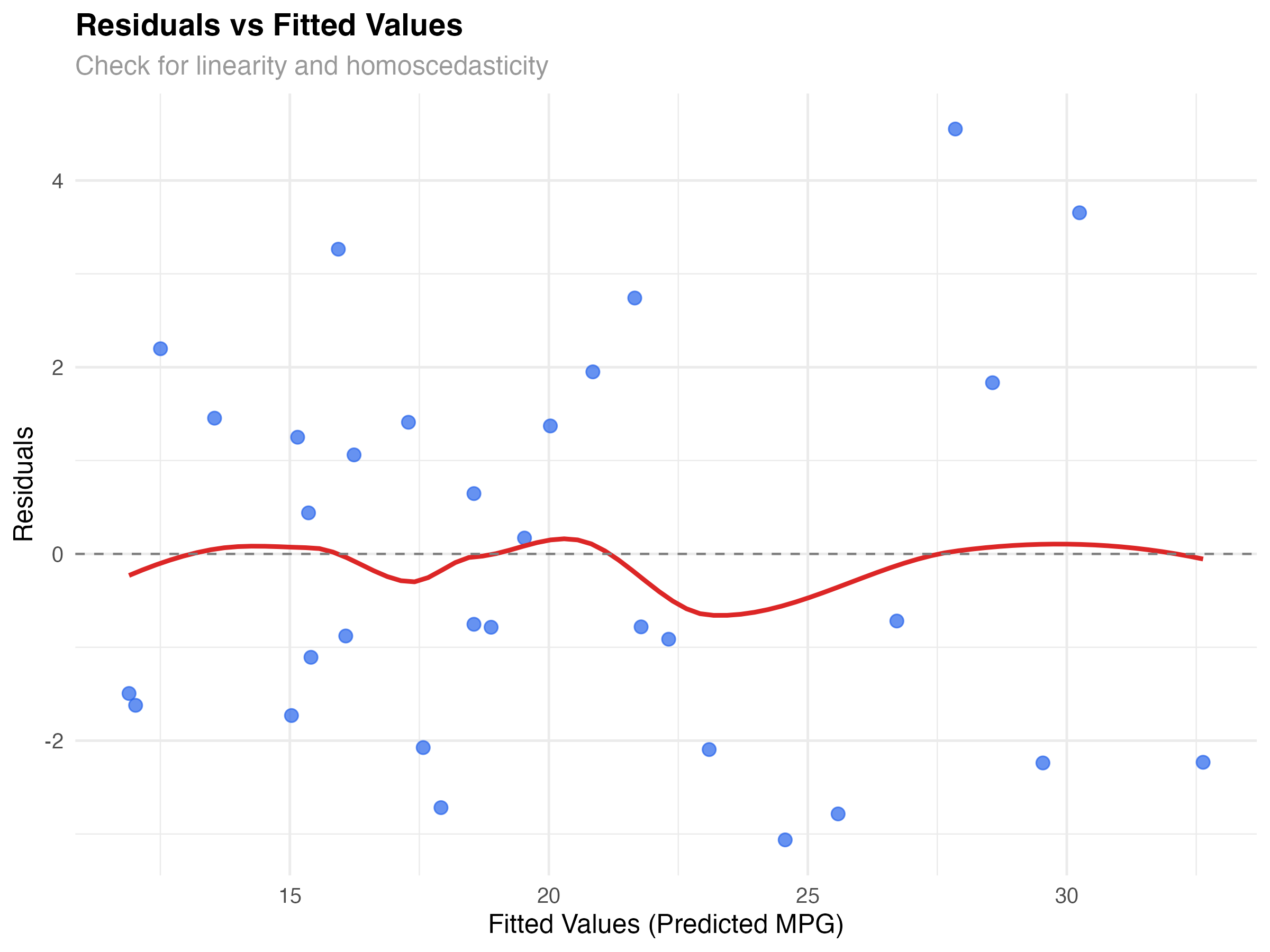
What to Look For
Our Model's Performance
The plot shows good news: residuals are roughly randomly scattered around zero with no strong patterns. The red smoothed line is relatively flat, suggesting our interaction model captures the main relationship effectively. There's slight variation in spread, but nothing concerning for a dataset this size.
# Create scale-location plot to better assess variance
model_data$sqrt_abs_resid <- sqrt(abs(model_data$.resid))

ggplot(model_data, aes(x = .fitted, y = sqrt_abs_resid)) +
  geom_point(alpha = 0.7, size = 2.5, color = "#2563eb") +
  geom_smooth(se = FALSE, color = "#dc2626", linewidth = 1) +
  labs(
    title = "Scale-Location Plot",
    subtitle = "Check for homoscedasticity (constant variance)",
    x = "Fitted Values",
    y = "√|Residuals|"
  ) +
  theme_minimal()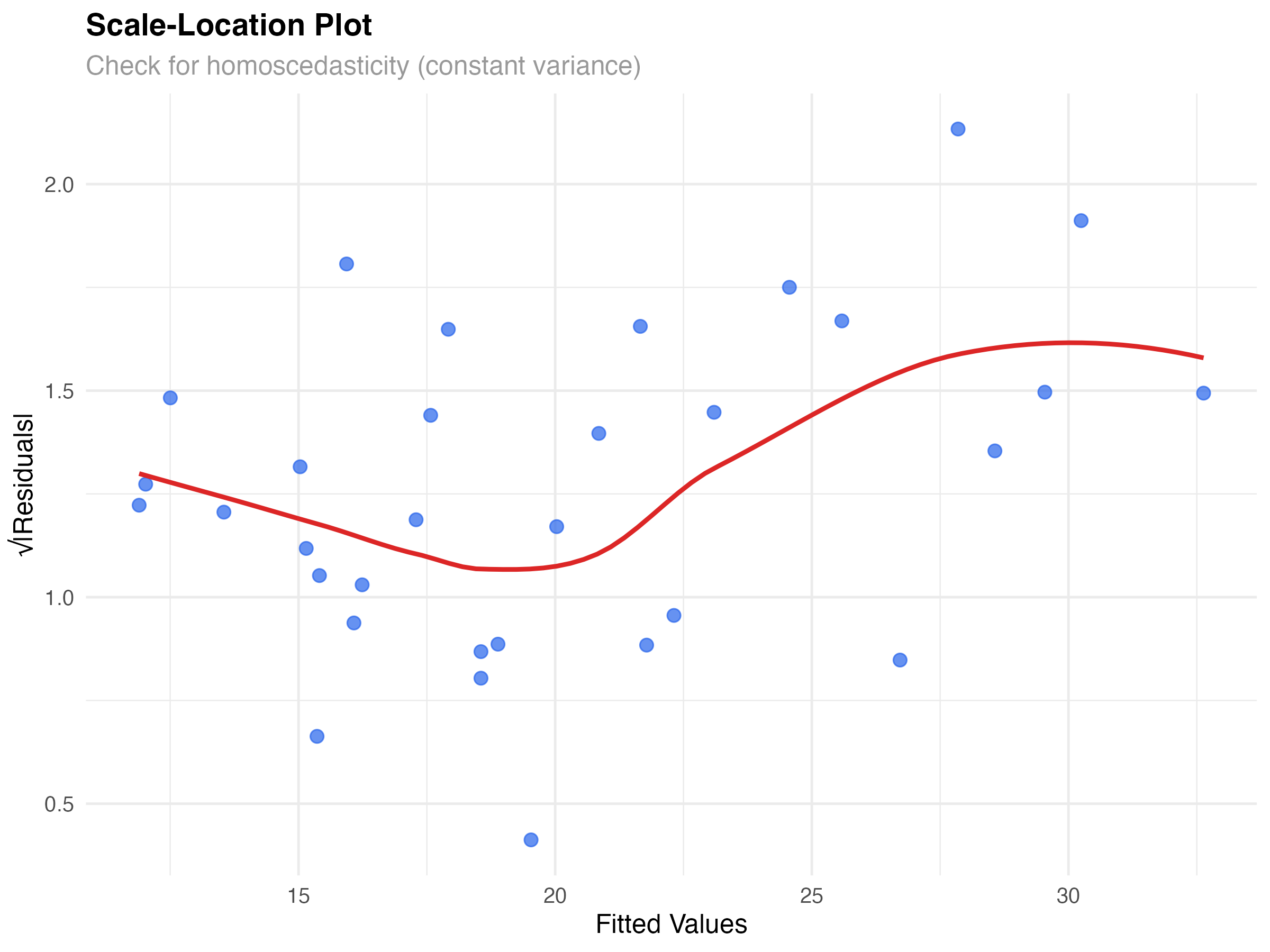
Q-Q Plots: Testing Normality Assumptions
Linear models assume residuals follow a normal distribution. Q-Q (quantile-quantile) plots compare your residuals to what we'd expect from a perfect normal distribution.
# Create Q-Q plot for normality assessment
ggplot(model_data, aes(sample = .resid)) +
  stat_qq(alpha = 0.7, size = 2.5, color = "#2563eb") +
  stat_qq_line(color = "#dc2626", linewidth = 1) +
  labs(
    title = "Q-Q Plot of Residuals",
    subtitle = "Check for normality of residuals",
    x = "Theoretical Quantiles",
    y = "Sample Quantiles"
  ) +
  theme_minimal()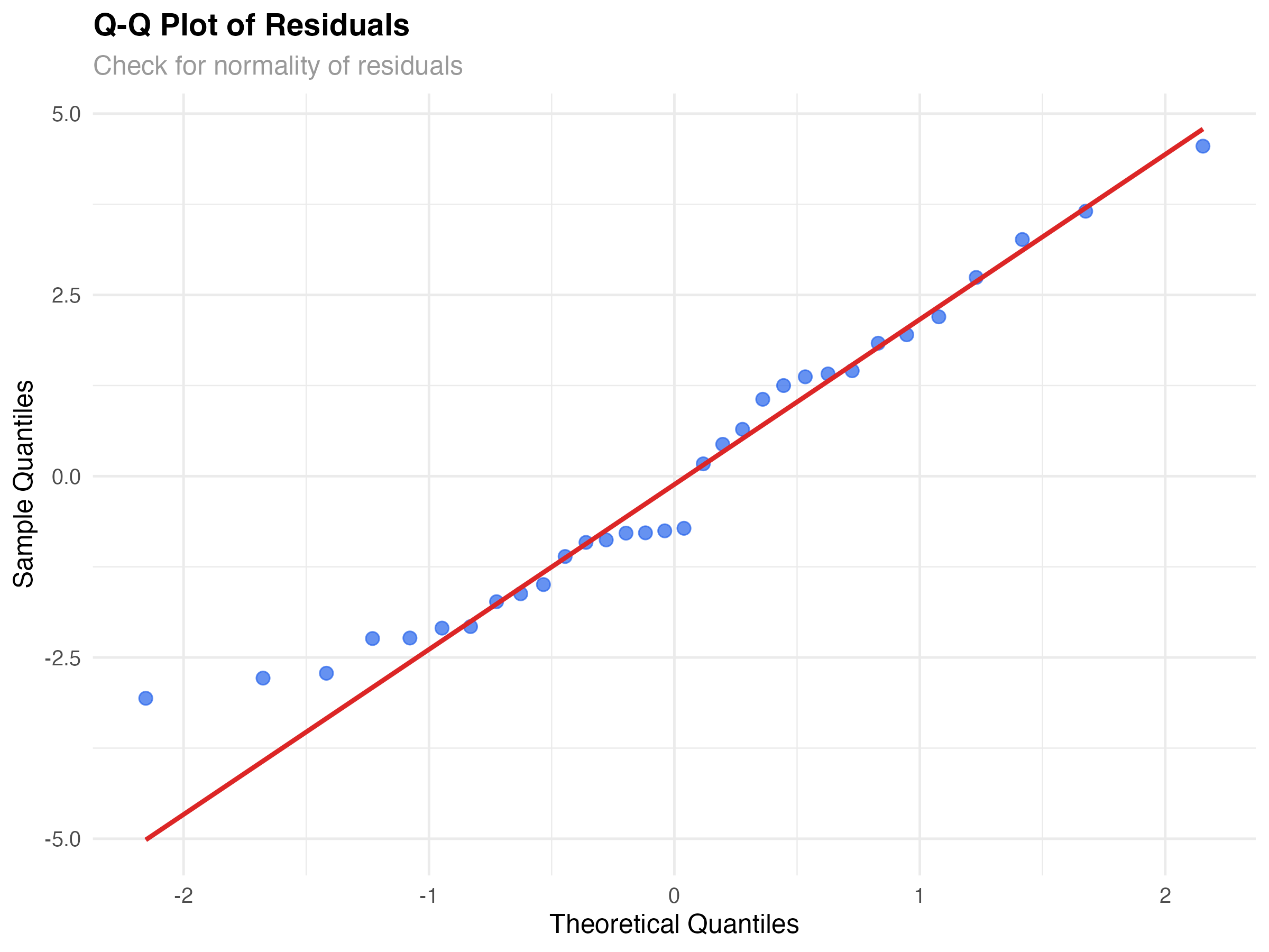
Reading Q-Q Plot Patterns
Our Model's Normality
Our Q-Q plot shows reasonably good normality. Most points lie close to the diagonal line, with some deviation in the tails. This is typical for real data and not concerning for inference or prediction with our sample size (n=32).
# Formal test for normality (use cautiously)
shapiro_result <- shapiro.test(model_data$.resid)
print(shapiro_result)

# Histogram of residuals for visual confirmation
ggplot(model_data, aes(x = .resid)) +
  geom_histogram(bins = 10, fill = "#2563eb", alpha = 0.7, color = "white") +
  geom_density(aes(y = after_stat(density) * max(..count..)),
               color = "#dc2626", linewidth = 1) +
  labs(
    title = "Distribution of Residuals",
    subtitle = "Histogram with density overlay",
    x = "Residuals",
    y = "Count"
  ) +
theme_minimal()Cook's Distance: Finding Influential Observations
Not all data points have equal influence on your model. Some observations can dramatically change your results if removed. Cook's distance helps identify these influential points.
# Calculate Cook's distance for influence
model_data$cooks_d <- cooks.distance(lm(mpg ~ wt * hp, data = mtcars))
model_data$observation <- 1:nrow(model_data)

# Plot Cook's distance
ggplot(model_data, aes(x = observation, y = cooks_d)) +
  geom_col(fill = "#2563eb", alpha = 0.7) +
  geom_hline(yintercept = 4/nrow(mtcars), linetype = "dashed", color = "#dc2626") +
  geom_text(aes(label = ifelse(cooks_d > 4/nrow(mtcars), rownames(mtcars)[observation], "")),
            vjust = -0.5, size = 3) +
  labs(
    title = "Cook's Distance",
    subtitle = "Identify influential observations",
    x = "Observation Number",
    y = "Cook's Distance"
  ) +
  theme_minimal()

# Identify influential points
influential_threshold <- 4/nrow(mtcars)
influential_cars <- model_data[model_data$cooks_d > influential_threshold, ]
print(influential_cars[, c(".rownames", "mpg", "wt", "hp", "cooks_d")])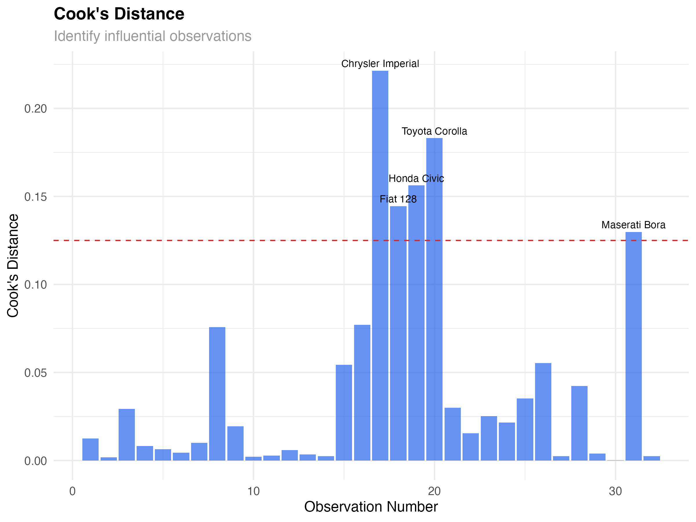
Influential Observations in Our Data
Five cars show elevated Cook's distance:
- Chrysler Imperial: Heavy luxury car with moderate horsepower
- Fiat 128, Honda Civic, Toyota Corolla: Very light, fuel-efficient cars
- Maserati Bora: High-performance sports car
# Leverage vs Standardized Residuals
leverage_data <- data.frame(
  leverage = hatvalues(lm(mpg ~ wt * hp, data = mtcars)),
  std_resid = rstandard(lm(mpg ~ wt * hp, data = mtcars)),
  car_name = rownames(mtcars)
)

ggplot(leverage_data, aes(x = leverage, y = std_resid)) +
  geom_point(alpha = 0.7, size = 2.5, color = "#2563eb") +
  geom_smooth(se = FALSE, color = "#dc2626", linewidth = 1) +
  geom_hline(yintercept = c(-2, 2), linetype = "dashed", color = "gray50") +
  geom_vline(xintercept = 2*4/nrow(mtcars), linetype = "dashed", color = "gray50") +
  geom_text(aes(label = ifelse(abs(std_resid) > 2 | leverage > 2*4/nrow(mtcars),
                               car_name, "")),
            vjust = -0.5, size = 3) +
  labs(
    title = "Leverage vs Standardized Residuals",
    subtitle = "Identify outliers and high-leverage points",
    x = "Leverage",
    y = "Standardized Residuals"
  ) +
  theme_minimal()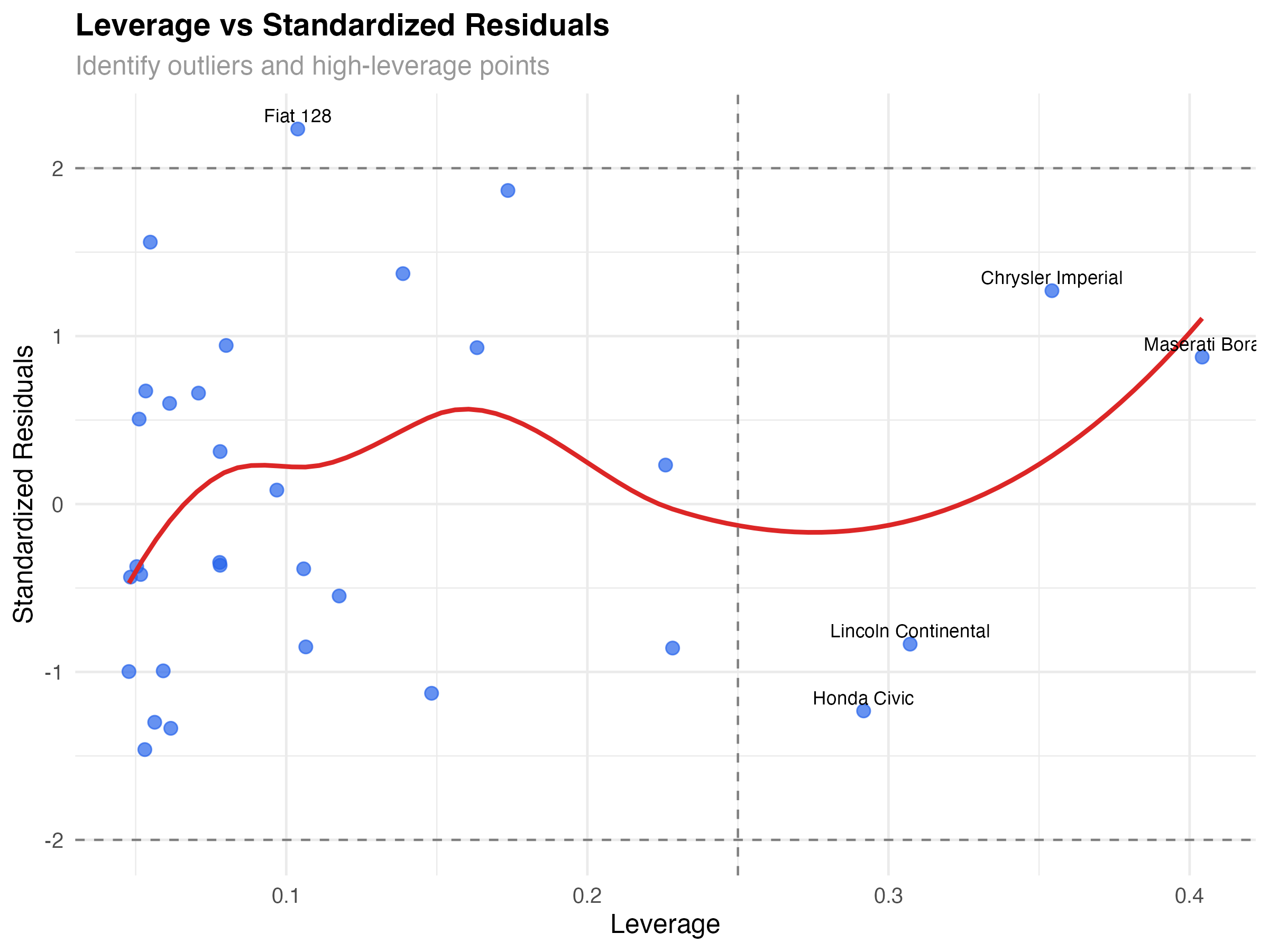
Types of Problematic Points
- High leverage, low residual: Unusual but well-predicted (Maserati Bora)
- Low leverage, high residual: Typical predictors but poor fit (none major in our data)
- High leverage, high residual: Unusual and poorly predicted (most concerning)
Visualizing Model Fit and Uncertainty
Beyond diagnostic plots, visualizing your model's predictions helps communicate results and assess fit across the predictor space.
# Create comprehensive model visualization
prediction_grid <- expand_grid(
  wt = seq(1.5, 5.5, 0.1),
  hp = c(100, 150, 200, 250, 300)
)

predictions <- predict(model_final, newdata = prediction_grid, se.fit = TRUE)
prediction_grid$predicted_mpg <- predictions$fit
prediction_grid$se <- predictions$se.fit
prediction_grid$lower <- prediction_grid$predicted_mpg - 1.96 * prediction_grid$se
prediction_grid$upper <- prediction_grid$predicted_mpg + 1.96 * prediction_grid$se

# Create publication-quality visualization
ggplot() +
  geom_ribbon(data = prediction_grid,
              aes(x = wt, ymin = lower, ymax = upper, fill = factor(hp)),
              alpha = 0.2) +
  geom_line(data = prediction_grid,
            aes(x = wt, y = predicted_mpg, color = factor(hp)),
            linewidth = 1.2) +
  geom_point(data = mtcars, aes(x = wt, y = mpg),
             size = 2, alpha = 0.7, color = "black") +
  scale_color_viridis_d(name = "Horsepower", option = "plasma") +
  scale_fill_viridis_d(name = "Horsepower", option = "plasma") +
  labs(
    title = "Model Predictions with Confidence Intervals",
    subtitle = "Weight-Horsepower interaction effects on fuel efficiency",
    x = "Weight (1000 lbs)",
    y = "Miles per Gallon (MPG)"
  ) +
  theme_minimal() +
  theme(legend.position = "bottom")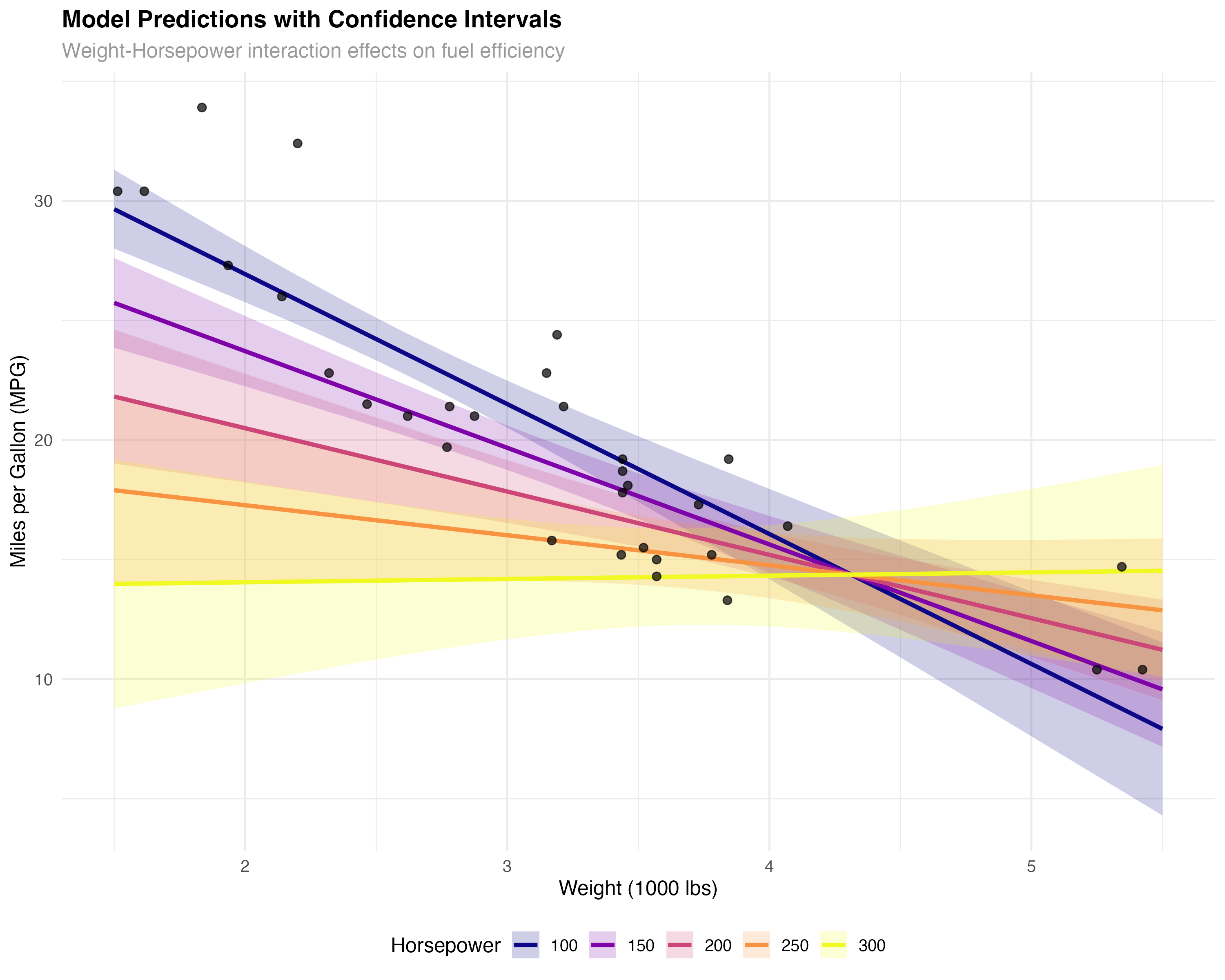
Key Insights from the Visualization
- Interaction effect: The slopes differ across horsepower levels - weight matters more for low-HP cars
- Model uncertainty: Confidence bands widen at the extremes where we have less data
- Good coverage: Most observed points fall within the confidence bands
- Realistic predictions: The model produces sensible fuel efficiency estimates across the range
Complete Diagnostic Checklist
Use this systematic checklist for any statistical model to ensure reliable results and valid inferences.
- Residuals vs Fitted: Random scatter, no patterns
- Q-Q Plot: Points roughly follow diagonal line
- Scale-Location: Flat trend line, constant variance
- Cook's Distance: No excessive influential points
- Leverage Analysis: Understand high-influence observations
- Prediction Visualization: Sensible results across range
Our Model Report Card
- ✅ Linearity: No curved patterns in residuals
- ✅ Homoscedasticity: Roughly constant variance
- ✅ Normality: Residuals approximately normal
- ✅ Independence: No time-series or clustering issues
- ✅ Influential points: Identified but legitimate
When Diagnostics Reveal Problems
- Non-linearity: Add polynomial terms, interactions, or use GAMs
- Heteroscedasticity: Transform variables, use robust standard errors, or GLMs
- Non-normality: Transform outcome, use robust methods, or different distribution families
- Influential outliers: Investigate data quality, consider robust regression
# Summary of model performance
cat("Model Diagnostic Summary\n")
cat("========================\n")
cat("R-squared:", round(1 - var(model_data$.resid) / var(mtcars$mpg), 3), "\n")
cat("RMSE:", round(sqrt(mean(model_data$.resid^2)), 2), "mpg\n")
cat("Mean absolute error:", round(mean(abs(model_data$.resid)), 2), "mpg\n")
cat("Influential observations:", sum(model_data$cooks_d > 4/nrow(mtcars)), "out of", nrow(mtcars), "\n")

# Prediction accuracy check
pred_accuracy <- data.frame(
  Metric = c("R-squared", "RMSE", "MAE", "Max Residual"),
  Value = c(
    round(1 - var(model_data$.resid) / var(mtcars$mpg), 3),
    round(sqrt(mean(model_data$.resid^2)), 2),
    round(mean(abs(model_data$.resid)), 2),
    round(max(abs(model_data$.resid)), 2)
  )
)
print(pred_accuracy)Summary and Advanced Diagnostics
What You've Mastered
✅ Diagnostic Skills Acquired
- Reading residual plots to assess linearity and variance assumptions
- Using Q-Q plots to evaluate normality of residuals
- Identifying influential points with Cook's distance and leverage
- Creating publication-quality model visualizations
- Applying systematic diagnostic workflows
- Knowing when assumptions are violated and what actions to take
Key Diagnostic Principles
- Visual first: Plots reveal patterns that summary statistics miss
- Multiple perspectives: Different plots check different assumptions
- Context matters: Consider your domain knowledge when interpreting influential points
- Perfect isn't required: Minor violations are often acceptable with adequate sample sizes
- Document everything: Include diagnostic plots in reports and publications
Advanced Topics for Future Learning
- Cross-validation: Testing model performance on new data
- Bootstrap diagnostics: Non-parametric assessment of model stability
- Robust regression: Methods less sensitive to outliers
- Mixed-effects diagnostics: Handling hierarchical data structures
- Generalized linear models: Beyond normal distributions
- Bayesian model checking: Posterior predictive diagnostics
- Apply this diagnostic workflow to your own research data
- Practice with different datasets: diamonds, iris, boston housing
- Try diagnostic plots with different model types (logistic, Poisson)
- Learn to create automated diagnostic reports
- Explore what violations look like with simulated data